Design Sprint for a museum in Wolin
Workshops prepared and co-facilitated for one of the biggest open-air museums in Europe.

Setting the scene
The workshops were a starting point for a concept of an interactive guide for one of the biggest open-air museums in Europe. We conducted a Design Sprint to get all the stakeholders on the same page and work closely on coming up with an MVP version of the project.
The goal
The main goal was to bring the stakeholders-experts together to come up with all the necessary elements for the MVP version of the product.
Preparations
Before deciding upon the most suitable method, we did a research on the industry as well as the existing benchmarks.

Materials from the https://www.thesprintbook.com/the-design-sprint
Method
Taking into consideration the challenge we were facing by bringing 5 different groups of stakeholders-experts to one table, we needed a set of moderated discussions and excercises that would lead to tangible takeaways by the end of the workshops.
Finally, we decided to organise a Design Sprint, which would allow us to achieve the set goals within the given period of time. The Design Sprint process is a method created at Google in 2010. It was inspired by, among other, by Google’s product development culture. More information about the Design Sprint can be found here.
Participants
The workshops were designed to bring all the stakeholders together and jointly kick off the project.
The experts participating in the sessions included:
- the decision-makers from the museum,
- the animatros from the museum,
- the university lecturer,
- the group of students,
- UX designers.
Course of the workshops
Equalizing knowledge
In the first day, we begun with structured discussions that helped us build a foundation for the rest of the activities.
For that we prepared a set of excercises, such as “how might we …?” – a problem-solving method – and moderated the conversations that arose. This allowed us to define key questions, as well as short and a long-term goals for the project.
Agreeing on the goals was a real challenge, since every expert had their vision of the path of the project. However, we managed to strip the ideas to the core and group them in a way that the joint direction became clear.
User journey map
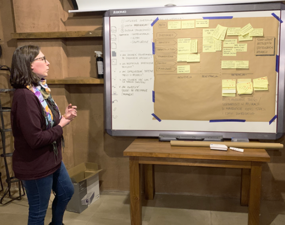
We then moved to making a simple map of the user’s interactions with the product. This took us a vast part of the first day, but we also held knowledge-sharing sessions of the experts. During these sessions the stakeholders shared their experience and knowledge in the context of the project.
Afterwards we agreed on the most important part of the user journey map and defined our workshops’ target. We chose the moment on the map that seemed like the biggest challenge of the journey that could be tested with users on interactive prototypes. This was crucial for us to structure the MVP.
Sketching
The second day of our workshops was devoted to sharing benchmarks and finding solutions for the chosen moment of the map. We begun with the so-called Lightning Demos that are a structured show and tell session of sharing visual ideas and inspirations.
For the second part of the day, every participant sketched their own detailed idea for a solution for the map segment. This required deep thinking and looking into the findings from the previously held sessions.

Taking up the decision
At the beginning of the third day of our workshops, we had a pile of sketched solutions. All we needed to do, was discuss them and decide which of the sketches should become basis for the last phase of our meeting, which was storyboarding.
For the decision-making process we used the five-step “Sticky Decision” method, that allowed to identify the best solution.
Storyboarding
As a last excercise, we used the winning parts of the sketched solutions and turned them into a storyboard, that became a detailed plan for the prototype of the application.

Next steps
We left the workshops with a set of guidance for the MVP of the product.
The next step of the process would be to prototype the MVP of the interactive guide and conduct usability tests.
Afterwards, our schedule is filled with all the tasks related to producing materials and developing the application.
Visual concept
The work-in-progress set of colours and fonts is currently under development. Some samples are available to look at below.


The MVP
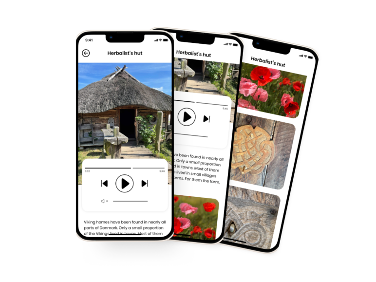
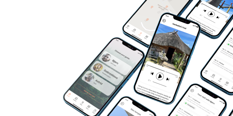
The very first version of the MVP is under construction. Some of the user interface is in place together with the navigation and the library of the audioguide.


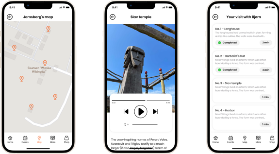
3 scenarios and AR
Initially, there will be 3 scenarios, each with a designed narrative that will bring visitors much closer to the history of the museum.
In the future we plan to add augmented reality (AR), which will allow to create engaging field games.
