User-friendly paywall
The aim was to improve specific metrics, find better design and make the process more user-friendly.
The task
A company offering an advert-sharing platform for all kinds of services related to pets needed to improve their paywall. The reason was that users were lost towards the end of the process, not realising that it was compulsory to pay for the service. Therefore, the conversion was too low.
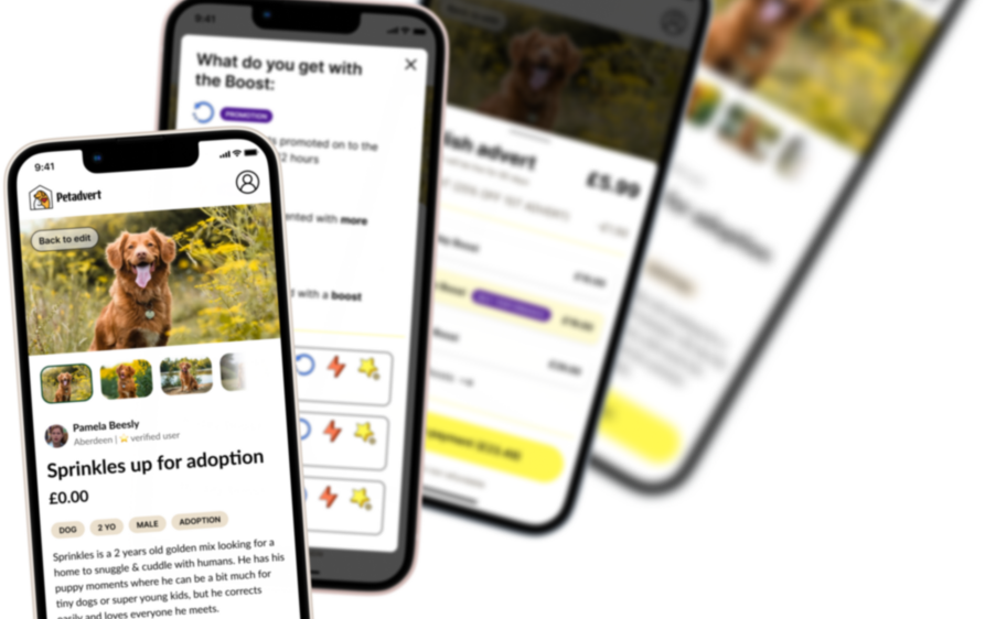
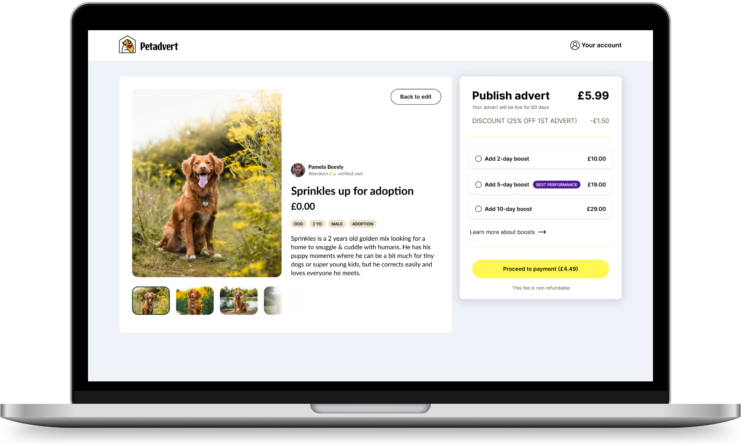
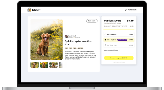
Although at the time the platform didn’t offer subscription, the last step, before successfully publishing an advert, was to go through a paywall and choose one of the 3 offers. The structure was rather typical for a paywall – the offers were presented on a separate page with short descriptions and not so visible


My role
I was asked to come up with ideas on how to increase the converstion and make the paywall visually appealing.
I had access to quantitative data regarding users and patterns in their behaviour.
Apart form research and benchmarking, I concentrated on presenting the service as a more tangible product.
Main changes
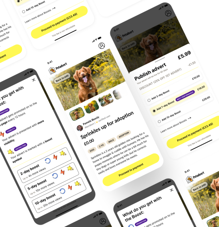
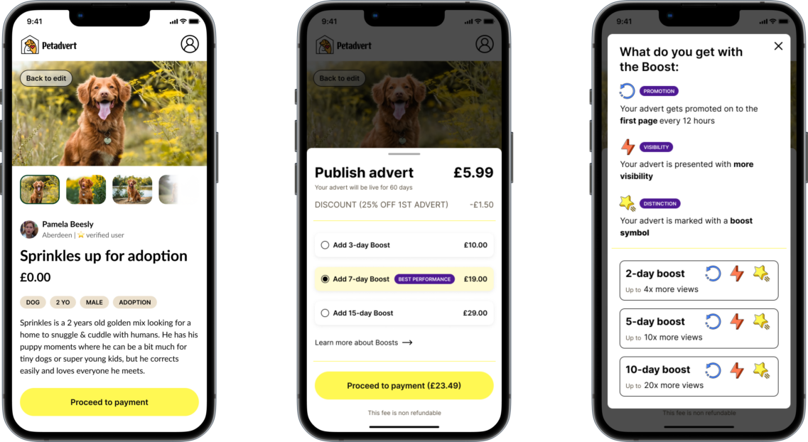
After a careful verfication of options, I decided to show the paywall next to the visualisation of the created advert. This way, it would be easier for the user to make the decision if they could see that the outcome of their advert looked good.
Furthermore, to decrease the number of users, who don’t realise that the payment is obligatory, I changed both the layout and copy for publishing the advert. This way it isn’t presented as an option, but it shows as a requirement to finalise the process.
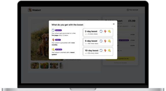
I also increased readibility, especially for the prices and the explanation of offers. For this I moved more descriptions to a separate pop-up. This way the user can concentrate on the process and the paywall isn’t packed with too much text and elements.

Further recommendations
My additional recommendation was to include an option to offer discounts to first-time users. This way users can try out the platform, test the process and decide whether they like is and want to use it.
Among recommendations I also suggested conducting A/B testing to find out which solutions would be best for achieving the desired conversion.
The platform also lacked clear information regarding the costs of publishing adverts. Therefore, I recommended including relevant pricing, available for every user before entering the process.
Visual redesign
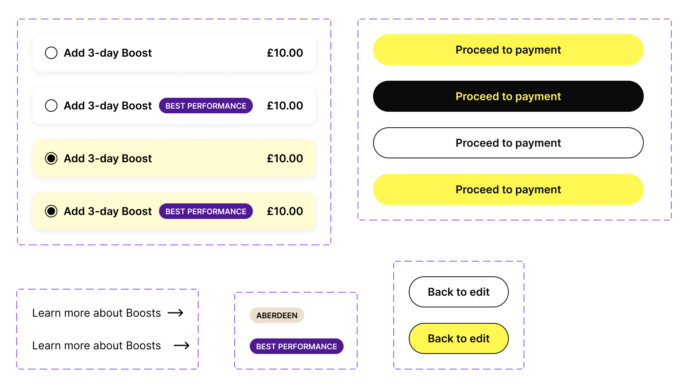
In order to make the paywall more mature visually I suggested clear design with appropriate spacing.
I made sure that the design is easy to read and navigate through.
My aim was to keep clear divisions between static and clickable elements and, at the same time, to spare colours.
Regarding typography, I aimed at good readibility and accessibility of the headings and descriptions, as well as copy on CTAs.
Components
For this project, as for any other I work on, I created components in Figma. Thanks to this approach, I can always quickly and easily change the entire design of all the created views.
Components allow me to work across different designs. They help to create and manage consistent projects.